
Introduction
I was at university when I first learnt about Inclusive Graphic Design, but not in a lecture hall. I would spend my free time on my laptop investigating Graphic Design principles further and advancing my knowledge. Through reading articles, websites and books, I was slowly learning more and more about how I could improve my work in such a way that it was more accessible for the disabled community. Today, I want to pass on that process to you.
My name is Luke Trower and I’m the Designer at Purple Goat Agency. I have been on the team for almost two years now. One of my specialisms is Inclusive Graphic Design, where I make graphics that are legible and perceivable to the disabled community. As someone who works in the heart of the disabled community, this is a topic that I focus on and practice every day. Therefore, in this time, I have learnt a few useful tricks and tips that I hope help you too.
What is Inclusive Design?
Inclusive Design can mean many different things, especially when considering the wide range of industries it reaches into. For today, I’m going to focus on Inclusive Design for the disabled community, and by this, Inclusive Design would be the process of creating things with the disabled community in mind.
When we consider the Social Model of Disability, it teaches us that people are disabled due to societal barriers that limit them from being able to participate in the full range of opportunities that society offers. When it comes to Graphic Design, the way that I bring this across is by saying that a disabled person cannot interact with a piece of design due to a lack of thought and consideration on the designer’s part. For instance, if the colour contrast of a piece is too low, and the typeface is illegible, then the designer has put a barrier in the way of someone, it is not the viewer’s fault. A knock-on effect from this may also disable them – if the piece of design is advertising an event, and a Dyslexic person, for example, is finding it hard to read where or when the event takes place, then they are excluded from being able to go.
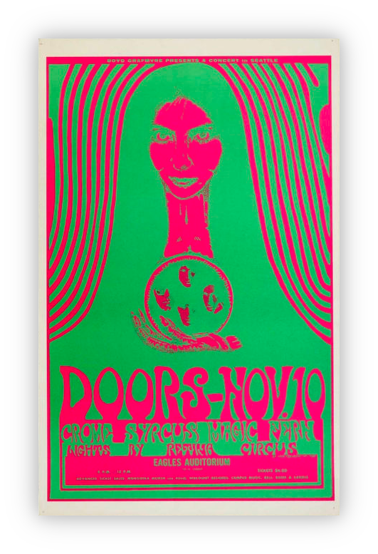
For many disabled people, a poster such as this 1960’s music poster would be hard to read. This may mean that they wouldn’t have been able to attend the event. There are several reasons for this poster being illegible. First, the colour contrast is incredibly low, with the ratio of the red and green being 1.71:1. As the minimum is 4.5:1, we can already tell that this is way off. In addition, the typeface is very decorative so may not be legible regardless of the colour contrast. Finally, both the green and red are highly saturated which would be visually overwhelming. If Inclusive Graphic Design principles had been followed, even just the three stated here, then more people would be able to interpret the poster and be included in attending this event.
Why Do Graphic Designers Make Illegible Design Decisions?
Personally, I think it would be wrong to suggest that all designers are doing this on purpose with no regard for disabled people’s needs. Sometimes, it could be due to a lack of time. Graphic Designers famously have very short deadlines, and it is often the case that the best solution is the one that gets you to the finish line quickest, which may also be the less accessible option.
However, I honestly believe that the number one reason for Graphic Designers not designing inclusively is simply because they are unaware these principles exist. My reasoning for this comes from observation and industry experience rather than objective proof, but I have noticed some patterns during my working life. Often when I talk to or work with other Graphic Designers, I will ask them questions as to whether they are aware of things such as colour contrast and accessible typefaces. The response is usually “No.” If you look around, there is no book called ‘The Graphic Designer’s Guide to Inclusive Design,’ and when we think about it, mainstream sources of Graphic Design education (universities, the internet, and large design organisations) do not teach this or have resources devoted to this area themselves. We have generations of Graphic Designers unaware of Inclusive Design Principles going out into the world and teaching future generations, completely skipping this important part of the process. Then as time goes on, and those designers go on to teach, the cycle continues.
How to Become a More Inclusive Graphic Designer
If there are no teaching materials out there, then how can you possibly learn about any of this? To me, this is where a lot of the skill comes into this part of the process, for we as Graphic Designers have to go out and look for what similar disciplines are adopting, and see how we can apply this in our own discipline. In the same way that we would be inspired by a painting or a piece of visual culture, we also need to look at areas such as User Experience Design, Product Design and Web Design to see what is being enforced there and see if there is anything that we can bring back to Graphic Design. The following paragraphs will tell you where you can start to look.
Learning About WCAG
The first and most important thing you can do is learn about the Web Content Accessibility Guidelines (WCAG). We are currently just entering WCAG 2.2, with version 3.0 on the horizon. If you want to read up on these principles, they can be found on the W3C website but you don’t need to do that as there are many amazing summaries out there too which will break the criteria down into more manageable pieces of information.
WCAG is made through a vigorous process of collaboration and approval to make sure that everything written is accurate and that there is a consensus on it. It is adopted by numerous institutions on a global scale and has authority in the space of Inclusive Design. WCAG is based on 4 guiding principles – that web content should be perceivable, operable, understandable and robust. As Graphic Designers, it is easy to look at this and wonder how something used for designing web applications can be used in Graphic Design, but there are a lot of crossovers.
However for people new to this area, it can be quite overwhelming to sift through all this information and figure out what is relevant to your design journey. So below I have included a bullet-pointed list of some introductory topic headers that you could try to research in relation to this:
- Colour Contrast
- Serif and Sans Serif Typefaces
- Alt Text
- Image and Video Descriptions
- Closed Captions
- Pascal Case Hashtags

Read My Favourite Inclusive Design Book
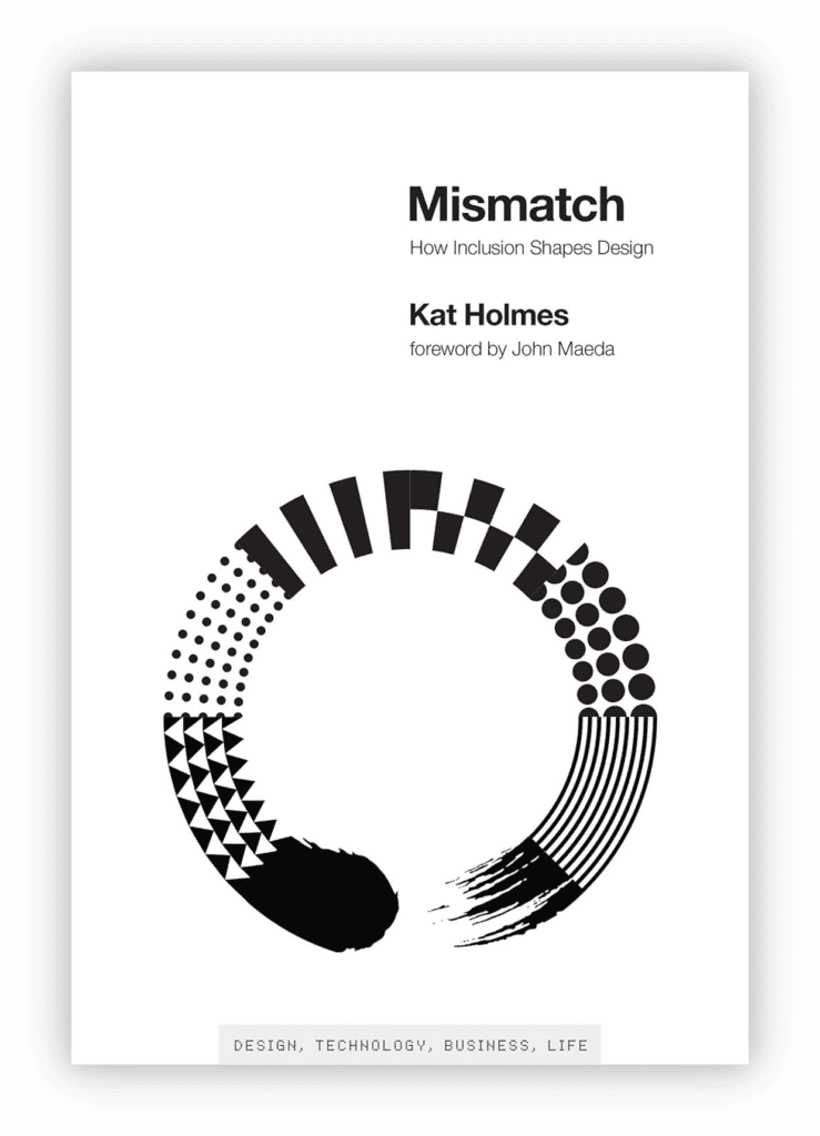
Like with all disciplines, books can be an excellent resource for Inclusive Graphic Designers too. When people ask me about learning more around Inclusive Graphic Design, the book I always recommend is ‘Mismatch: How Inclusion Shapes Design’ by Kat Holmes.
Like with the previous point, there is very little here that is directly ‘Graphic Design’ but there is a lot that can be learnt from this. ‘Mismatch’ has always stood out to me because it isn’t prescriptive – it doesn’t give a list of strict guidelines to follow. What it does, however, is provide many real-world examples of how Inclusive Design has been applied to many different areas and demonstrates the various ways in which designers have overcome problems. To me, this is important because not everything in Inclusive Design (and especially Inclusive Graphic Design) has a solid answer. Sometimes, you need to examine the problem and come up with your own solution to make something more accessible and inclusive.
For me, the main takeaway from this book is that one size never fits all. One of the important lessons I have learnt over the years about Inclusive Graphic Design is that the true solution is actually a suite of solutions that people can tailor to their own needs and requirements. Some of the examples presented here exemplify that and show why everyone needs to be considered from early in the design process.
Connect with Other Inclusive Designers
Reach out and try to connect with other Inclusive Designers to expand your knowledge and become a part of the community. LinkedIn is an especially good tool for this – it is how I met most of my Inclusive Design connections! There are also certain pages you can follow such as the Purple Goat Agency pages on all social media platforms where we often put out tips on how to be more inclusive in your social media.
Practice, Practice, Practice!
And finally, the best thing I can suggest to you for learning more about Inclusive Graphic Design is to practise Inclusive Graphic Design! These principles can help guide you, but they are useless unless you consciously apply them to your work. In the beginning, this may feel a bit restrictive and challenging, but the more you apply these principles, the more you will see solutions.
And if you have followed the above tip and have connected with other designers, then make sure to ask for feedback from your connections to also improve and expand your knowledge. One of the best things about design is being able to connect with others and learn from each other, so make sure you’re doing this from an inclusivity and accessibility perspective too!
Remember, unlike other areas such as Web Design or Product Design, there are fewer ‘set-in-stone’ principles when it comes to Inclusive Graphic Design because the area has not been explored as much. Even if you read every last principle and apply it from other disciplines, Graphic Design is still fundamentally different. Therefore, you need to be the one helping to create the solutions and move towards a more inclusive design industry.
Let Purple Goat Help You!
Purple Goat Agency offers bespoke training packages in Inclusive and Accessible Design, as well as other topics too such as Inclusion and Accessibility for Social Media. We can tailor packages specifically for your business and offer advice relating to your branding, while also answering any questions that you may have. Or if there is something specific that you want us to cover, then let us know and we can make a training course unique to your requirements. Get in touch with our team to discuss your business needs – we’d love to hear from you!
Conclusions
Currently, there is not a lot of solid guidance for Graphic Designers looking to become more inclusive in their practice. Therefore, the best advice I can give is to look to other similar disciplines and adopt their Inclusive Design principles. I hope the above guidance has given you a start in where to look and what to do.
If you want to have specialised training or guidance on how to adopt Inclusive Graphic Design into your practice, then make sure to reach out to us at Purple Goat Agency where we can discuss how to help your business develop in this area. Also make sure to follow us on our social media platforms to keep up-to-date with the latest guidance that we put out on social media.
So until next time, thanks for reading!
Luke