
My name is Luke Trower and I am the Designer at Purple Goat Agency. I specialise in Inclusive Graphic Design – making graphics that are legible and perceivable to the disabled community. In my role, I strongly believe in sharing my knowledge with others to improve inclusivity in the Design Industry.
One point I always make when talking about Inclusive Graphic Design is that often Graphic Designers are not taught about how to implement it into their workflow. Art and Design Schools with graphic design programs do not focus on why or how accessible design is important to the students, and thus, those students will never learn about it. This is an area that I feel requires serious improvement in Arts education, but it is something that I alone cannot fix.
This is what inspired me to make today’s article. Improving inclusive graphic design requires systematic change, but there are many small things that individuals can also do to make a big difference. As the Adobe Suite is one of the most widely-used tools by graphic designers in their workflow, I thought it would be a good idea to teach any readers who use these tools some of those small steps to improve their designs.
When I started to venture into learning about Inclusive Graphic Design myself, I didn’t know where to start. There are very few resources in the world to help Graphic Designers think in a more inclusive way. I believe that doing something is better than doing nothing, so even if this article doesn’t contain every way you can use Adobe inclusively, my hope is that it helps you to begin thinking about which tools are available to you so you can do more research and explore further yourself. Inclusive Graphic Design is an ongoing learning experience, there is always more that we can learn and do. Once you get into the mindset of designing inclusively, you’ll start to think about more aspects of your work and see areas to improve accessibility that you won’t have seen before.
So below I have collected some useful inclusive design tips for Adobe that I like to use in my workflow for a range of different tools, and have split them by Adobe program.
What is Inclusive Design?
Inclusive Design means a lot of different things in a lot of different contexts. Here, it means making design considerations with the disabled population in mind, to ensure that graphics are legible and perceivable. This should be undertaken with disabled people as part of the design process.
These considerations can cover anything from typography, colour, imagery and a wide array of other areas. The end goal is to ensure that there is a balance between communicating the essential information while using decorative elements to support this.
Accessibility on Adobe Photoshop
A lot of Adobe Photoshop’s basic tools can be used in ways to make your graphics more accessible. They can be used in quite a precise way, giving the user a lot of control over how far an effect will be applied.
I often use some of the fill and adjustment layers such as ‘Levels’ and ‘Colour Balance’ in ways to improve colour contrast in images. The scale and extent to which these tools are used is one of Photoshop’s best features in my opinion, as it always allows me to find the careful balance between the original work and what is most accessible.
To me, this software is a reminder that Inclusive Design doesn’t always have to come from bespoke, tailored tools, but instead can come from rethinking how we use the essential tools that programs already contain. Even remembering to use Photoshop’s colour picker to find hex codes from screenshots to put into a colour contrast checker is a valid use of the program for accessibility.
Accessibility on Adobe Illustrator
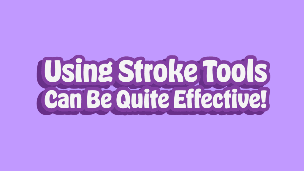
Like with Photoshop, some of Adobe Illustrator’s best tools for general Graphic Design can be applied to make graphics more accessible. In this article, I’d like to give a particular mention to Illustrator’s various stroke tools and how they can be very useful in making text more legible.
Quite often, I see designers using light text on pale backgrounds. Black text on such a background wouldn’t have the same aesthetic, but would have much better colour contrast than the white. To get around this, I often like to apply a thick, dark stroke to my lighter text to give it better contrast against light backgrounds.
Using Illustrator’s default ‘Stroke’ property can be quite limited with text though, so instead, I recommend following this process:
- Write out your text in Illustrator.
- Duplicate it.
- Select the below copy, then go to Object > Expand and click ‘OK’ on the window that pops up.
- Your below layer will now be a solid fill shape instead of text, so turn on the stroke and deactivate the fill. When activating the stroke, make sure to change the colour so it is darker than your text and background.
- Using the ‘Stroke’ window, you can change the Align Stroke to ‘Outside.’
- Expand the point size of the stroke until you are happy with the result. I often go larger with a bold font because the two compliment each other well.
With that, you have stylish-looking text that is also legible to a wider audience. In the example below, I have applied a few more effects to make a solid Drop Shadow to extend this further, but you can use whichever extra effects that you like.
Accessibility on Adobe InDesign
Adobe InDesign has a wide range of accessibility features to help make your PDFs more accessible. While the whole process of PDF remediation would be too much for this article, I’ll share a few tools here that can start to improve the accessibility of your works.
The main two features that we will cover here concern making PDFs accessible for screen reader users. For some members of the disabled community, particularly visually impaired and blind users, screen readers aid with website and document navigation. They allow users to move through a piece of content as they see fit, being able to either skim through headers or go more in depth on specific areas.
When a PDF is created, the exporter doesn’t know how to mark up specific sections as either header or body copy. It doesn’t care about the size of the text, or where it is placed, all text is considered equal unless otherwise specified. The same is also true of images. Unless you manually add alt text to an image, the exporter assumes that the image is considered decorative and that you want the screen reader to skip over it.
PDFs can be a highly accessible file format when implemented properly. This is why the following features are an important start into learning more about how to make PDFs accessible, as they can be an excellent way to communicate information to a wide audience.
1. Alt Text in InDesign
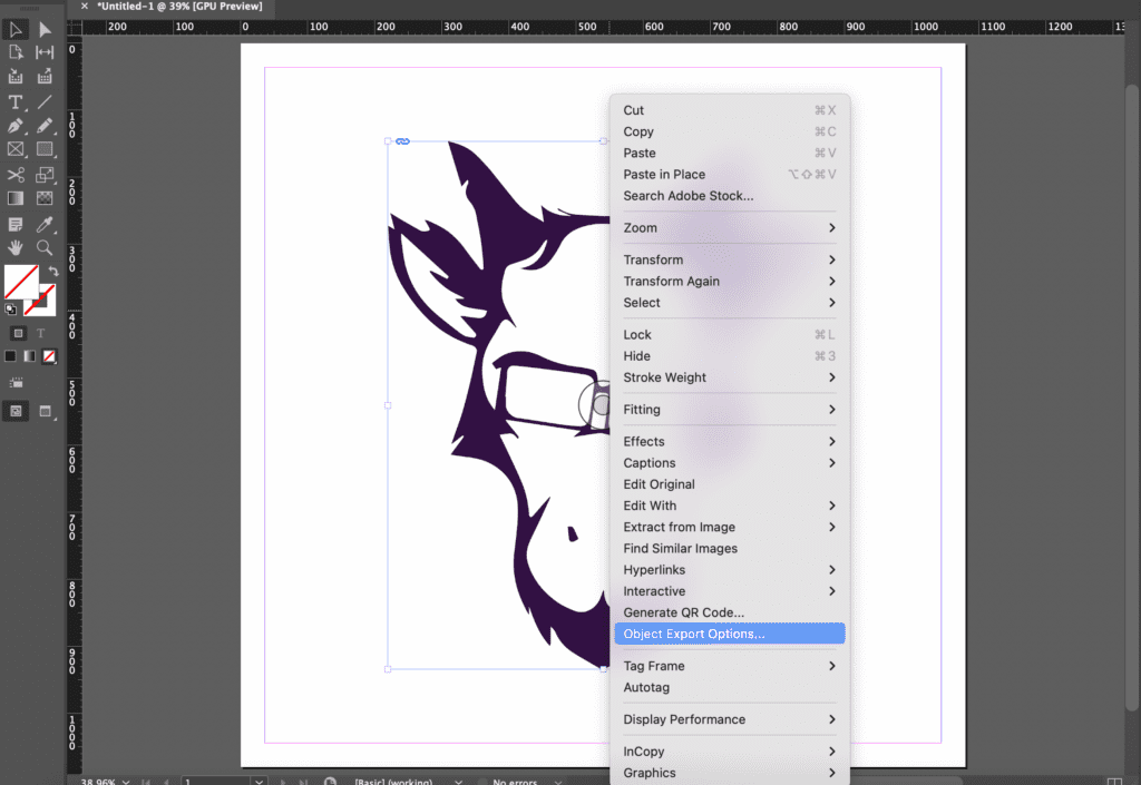
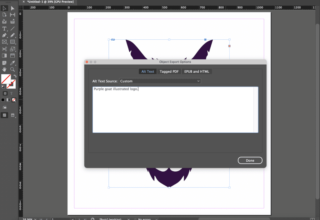
Did you know that you can create alt text for images in InDesign?
When you right click on an image, look for an option called ‘Object Export Options.’ Clicking on this will bring up a new, small window. There is a drop down menu at the top for ‘Alt Text Source,’ which if you change to ‘Custom,’ will allow you to write in your own alt text. Click ‘Done,’ when you are finished to apply the change! Remember as well to export your document as an Interactive PDF to preserve any alt text that you have added.
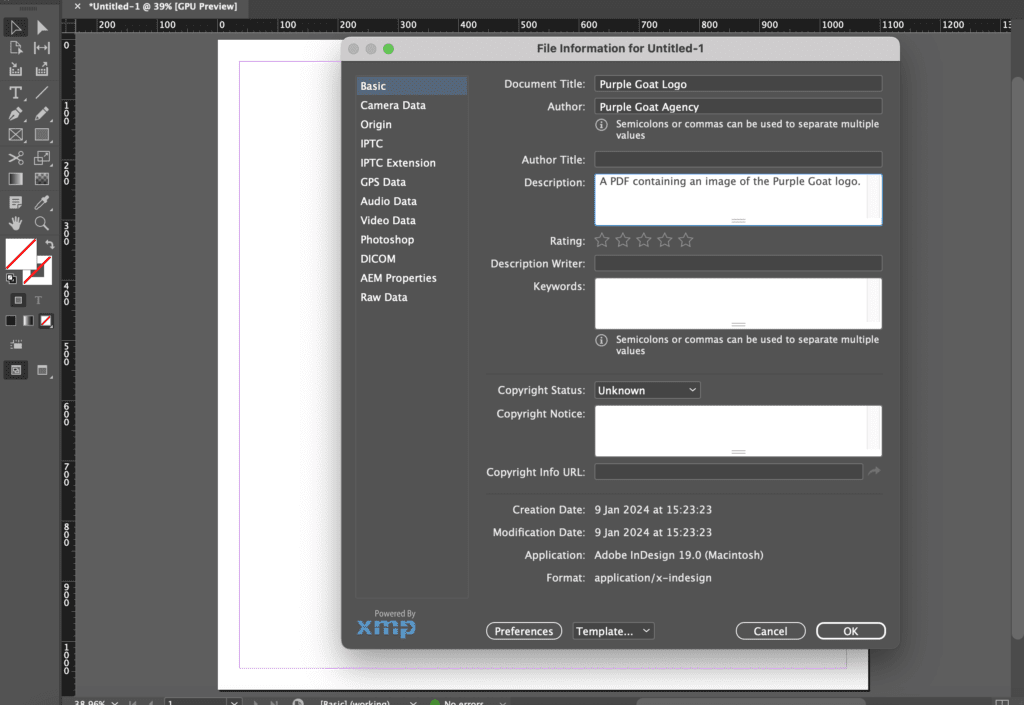
2. Give Your PDF an Author and Description
Another way you can make your PDF more accessible for screen reader users is to apply some metadata that describes it. This can be found in the topbar by going from ‘File,’ to ‘File Info…’ The three most important pieces of information to add here are the ‘Document Title,’ which is what the document is called, the ‘Author,’ which will be your name or organisation and the ‘Description,’ which you can think of as alt text to describe what’s in your PDF. Again, when it comes to exporting this, export the document as an Interactive PDF.
Accessibility on Adobe Acrobat
Like InDesign, Acrobat has a variety of good accessibility features that you can utilise in your workflow. These quite often pair quite well with InDesign’s accessibility tools. One feature in Acrobat that can be quite helpful is the in-built ‘Accessibility Checker,’ that allows you to find accessibility issues quickly in your PDF. What I particularly like about this feature is that if it brings back an error, you are able to investigate it further to learn how to fix it.
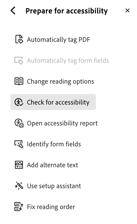
Here are the steps for how to access it:
- Under the menu on the left, click on ‘View More,’ and from the extra options select ‘Prepare for Accessibility.’
- Click on the button labelled ‘Check for Accessibility.’
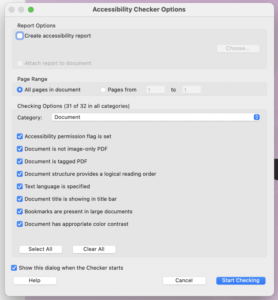
- A window will pop up, tick the options the same as I have in the image below. Then start it by selecting ‘Start Checking.’
- On the right, the report will appear identifying any errors.
- These errors can be identified further by right clicking on the error and selecting the various options from the dropdown that appears such as ‘Fix,’ and ‘Explain.’

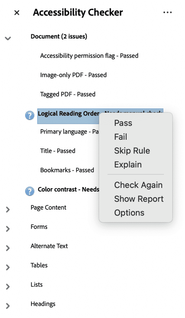
One thing to be aware of is that in the accessibility report, ‘Logical Reading Order,’ and ‘Colour Contrast,’ will always require a manual check, so those will always be displayed as potential issues no matter what.
If this is the first time you have considered PDF accessibility, then chances are that the report will show a lot of mistakes. Don’t be disheartened if this happens, it doesn’t mean that you haven’t tried, marking up PDFs for accessibility is challenging and requires a good level of technical knowledge. There are many ways that you can improve upon this, such as by taking an online course. LinkedIn Learning has several that could be useful to you.
Accessibility of Adobe Fonts
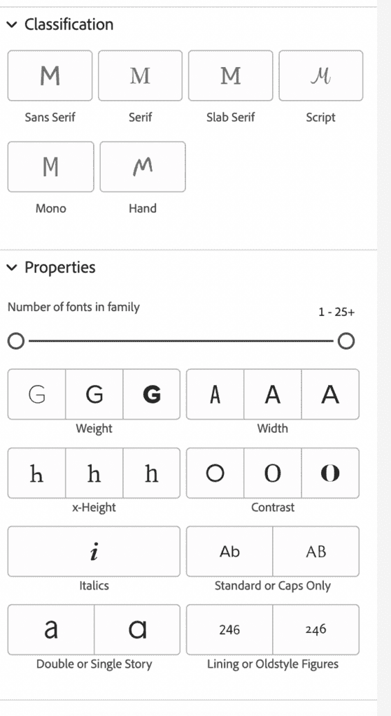
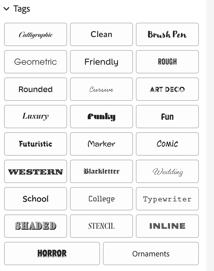
One trap with inclusive typefaces is using the same ones over and over again. We expect to see Helvetica and Futura in a lot of places, but there are other amazing and highly legible typefaces that also exist!
Remember to use the filters on Adobe Fonts to single out sans serif fonts with good weight and begin searching. I also like using ‘Tags,’ to help me find a typeface with the perfect personality for my project.
Conclusion
The Adobe Suite offers users a good amount of potential when it comes to making accessible and inclusive design. While there is room for more features to improve this and encourage users to explore this area further, there are plenty of features, particularly in InDesign and Acrobat, that help users.
This article only contains a fraction of the tools and tricks you could use to make your design more accessible. My hope from this is that it encourages you to try some of these techniques for yourself and use this as a starting point to explore this area more in the future.
If you would like to learn more about how to become an Inclusive Graphic Designer, I wrote an article about that. In addition, I have spoken several times on the Purple Goat Podcast about Inclusive Design, including a recent episode where I spoke to William Bunch from Zoonou.
In addition, if you are looking to upskill in diversity and inclusion, then you can contact us to enquire about our diversity and inclusion training offering.